Sankey charts aren’t the most popular chart, but they are one of the best ways to visualize funnels and customer journeys. The hardest part about building Sankey charts is the data structure that is required to power them. You need to structure your data into steps based on user segments that cover all potential entrances and exits from your funnel. Capturing user IDs or customer IDs in your allows you to see the customer journey down to the individual customer level.
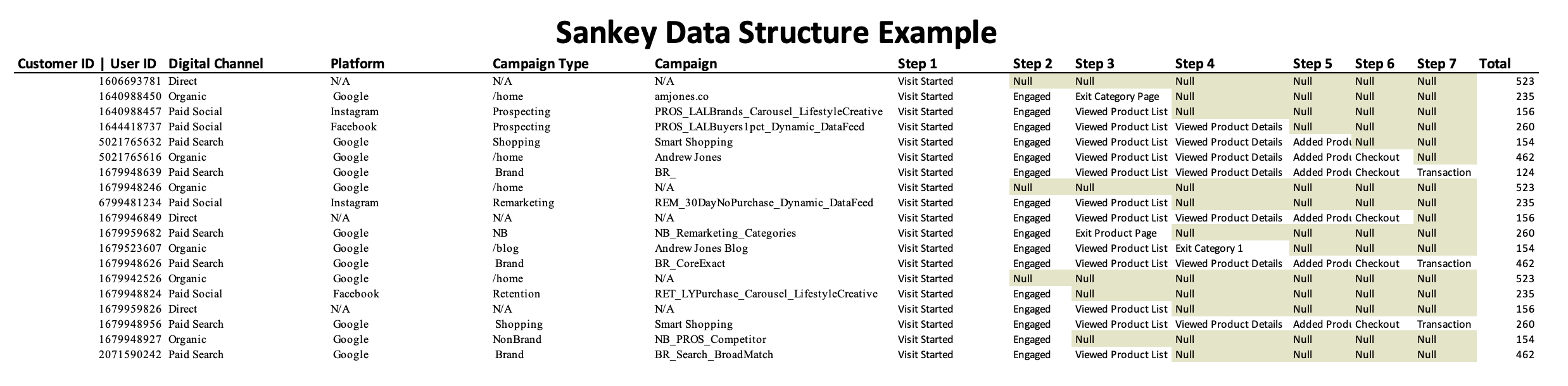
Clean data collection allows for nearly limitless sub segmentation based on user’s types, campaign types, platforms, audiences, creative, and more. The data is then structured into stages of the journey which then indicate whether the customer has completed a step and then either proceeded to the next step or exited.
The exits can be labeled based on sub segments as well. For example you could subset exits based on the category a user was viewing when they exited your product list page. This could show you which product lines are not resonating with customers or inversely which product lines have very low exit rates.
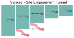
The sankey chart provides an extremely clean way to view your on site e-commerce funnel. It can show the rate at which users progress through the funnel as well as the areas of the site where there are the most exits. Adding data controls to the chart will allow you to show how the progression through the funnel varies based on marketing channel, audience, or creative exposure. It can also help you identify key segments to reengage in order to optimally drive conversion.
The one drawback to the sankey chart is the rather unique data structure that is required to power it. To create this data structure you must create user segments that show progression through individual portions of your defined funnel. Building this structure requires thought and data transformation skill so it is not ideal for novice Business Intelligence analysts. The output however is well worth the investment for an experienced analytics professional.